
Pottery Barn | Global Toolkit
Challenge: Building and managing a cohesive design system for scalable, consistent global experiences.
Role: Visual/ UX Designer
Team: Designers, Researchers, Engineers, Product Managers
Focus: Visual system creation, UI kit development, component documentation, cross-team collaboration.
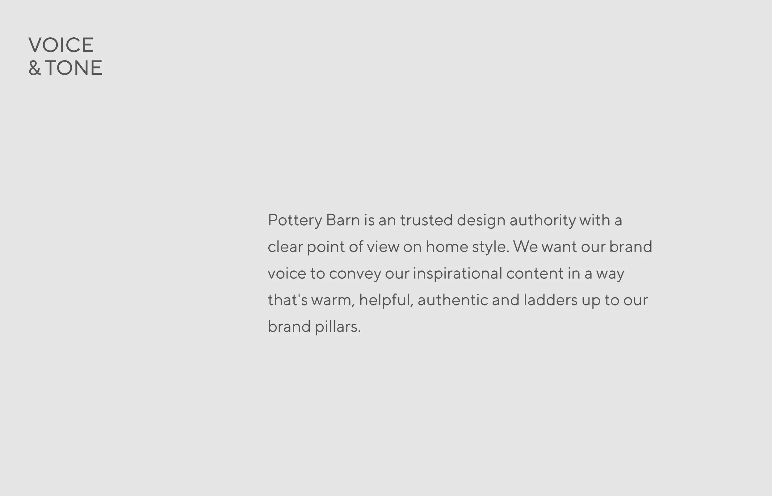
Overview
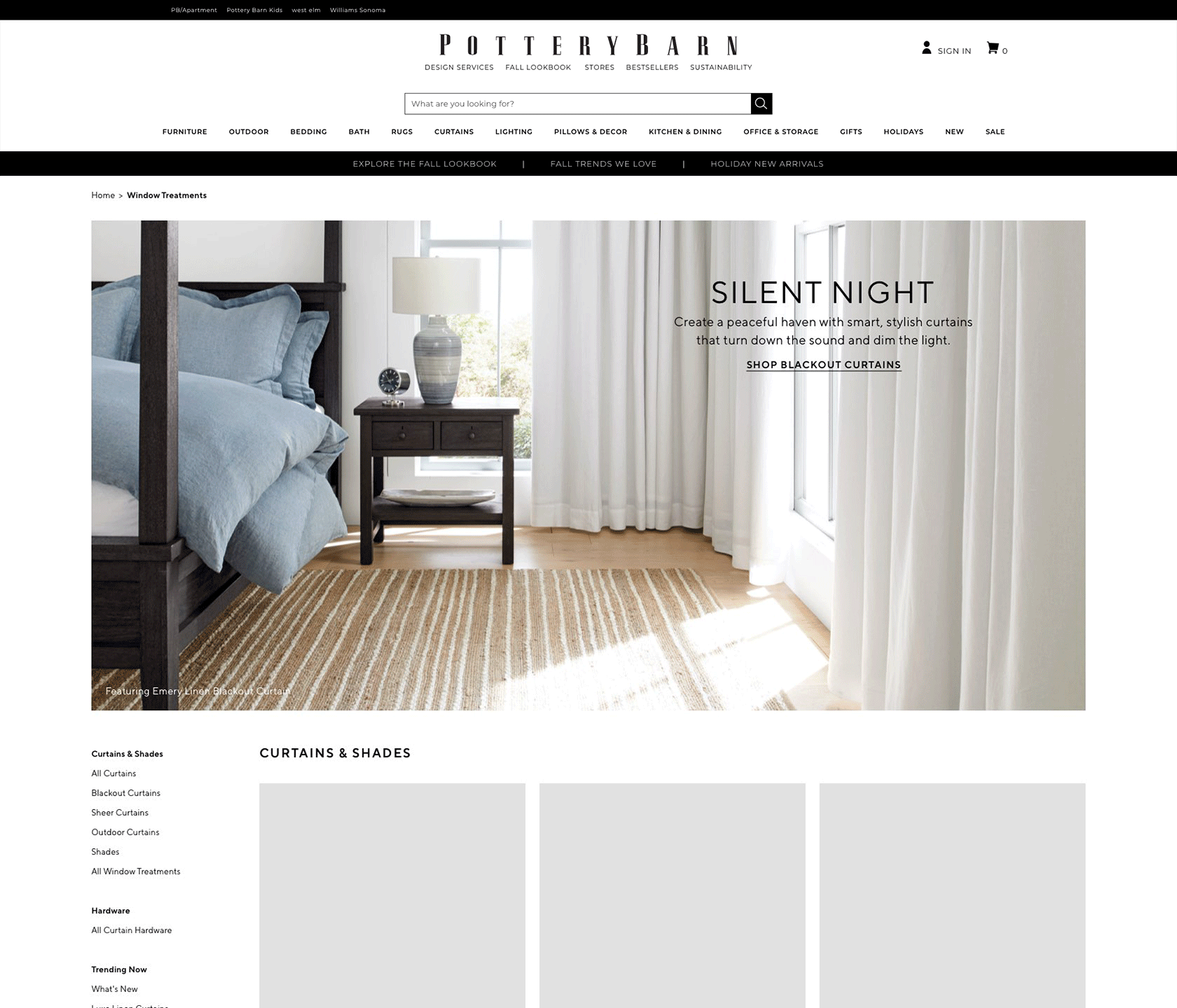
Pottery Barn needed a unified digital system to address inconsistent UI patterns, scattered assets, and slow design-to-development workflows across global teams. The Global Toolkit established a clear visual language, reusable components, and streamlined handoff practices—dramatically improving production efficiency and brand consistency.
Challenge
Multiple regional teams operated without a single source of truth, leading to duplicated work, mismatched styling, and longer development cycles. Pottery Barn required a flexible, centralized system that could support weekly marketing needs, seasonal refreshes, and international variations.
🛠️ Production
🛠️ Production
Audit & System Definition
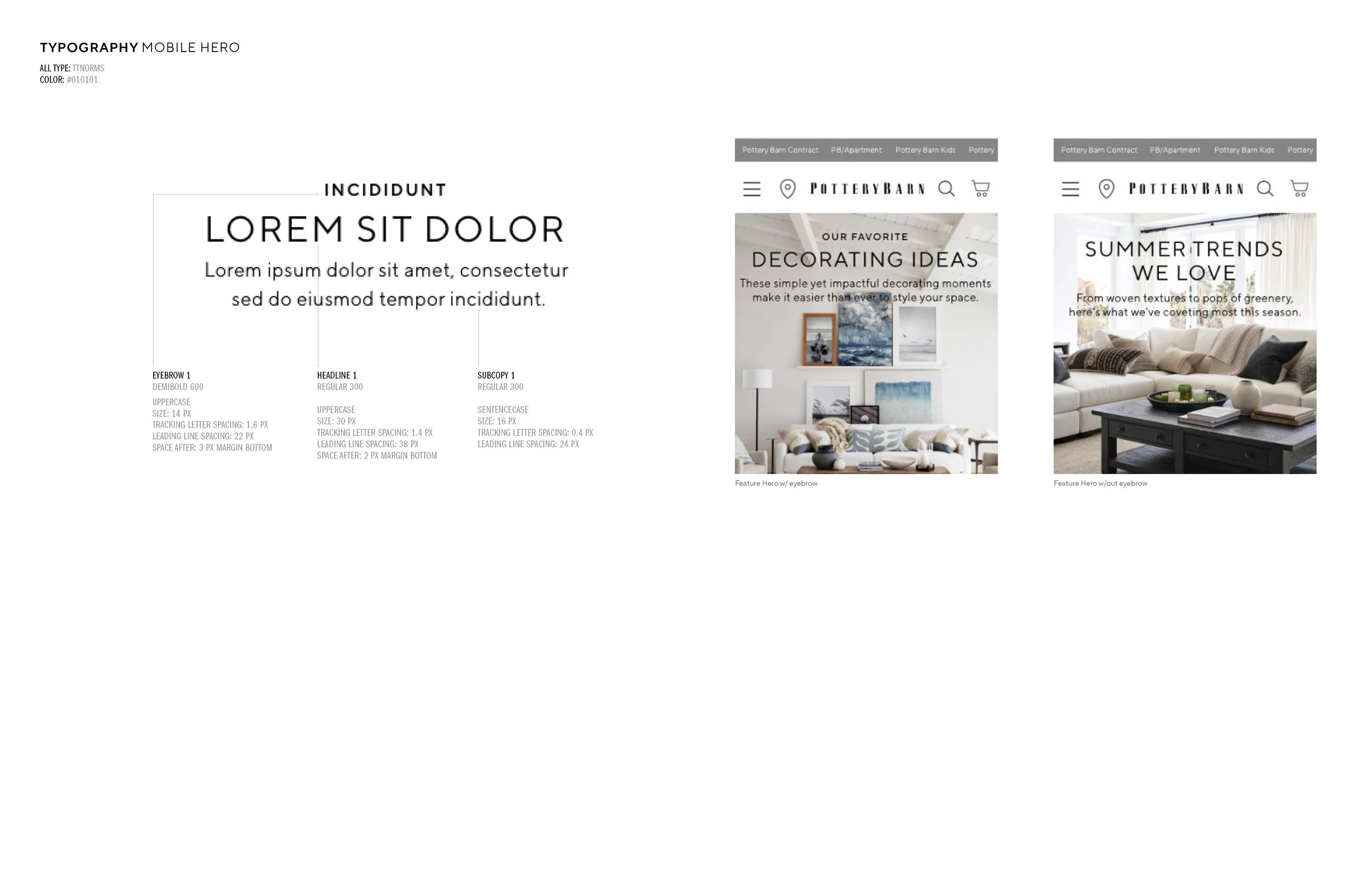
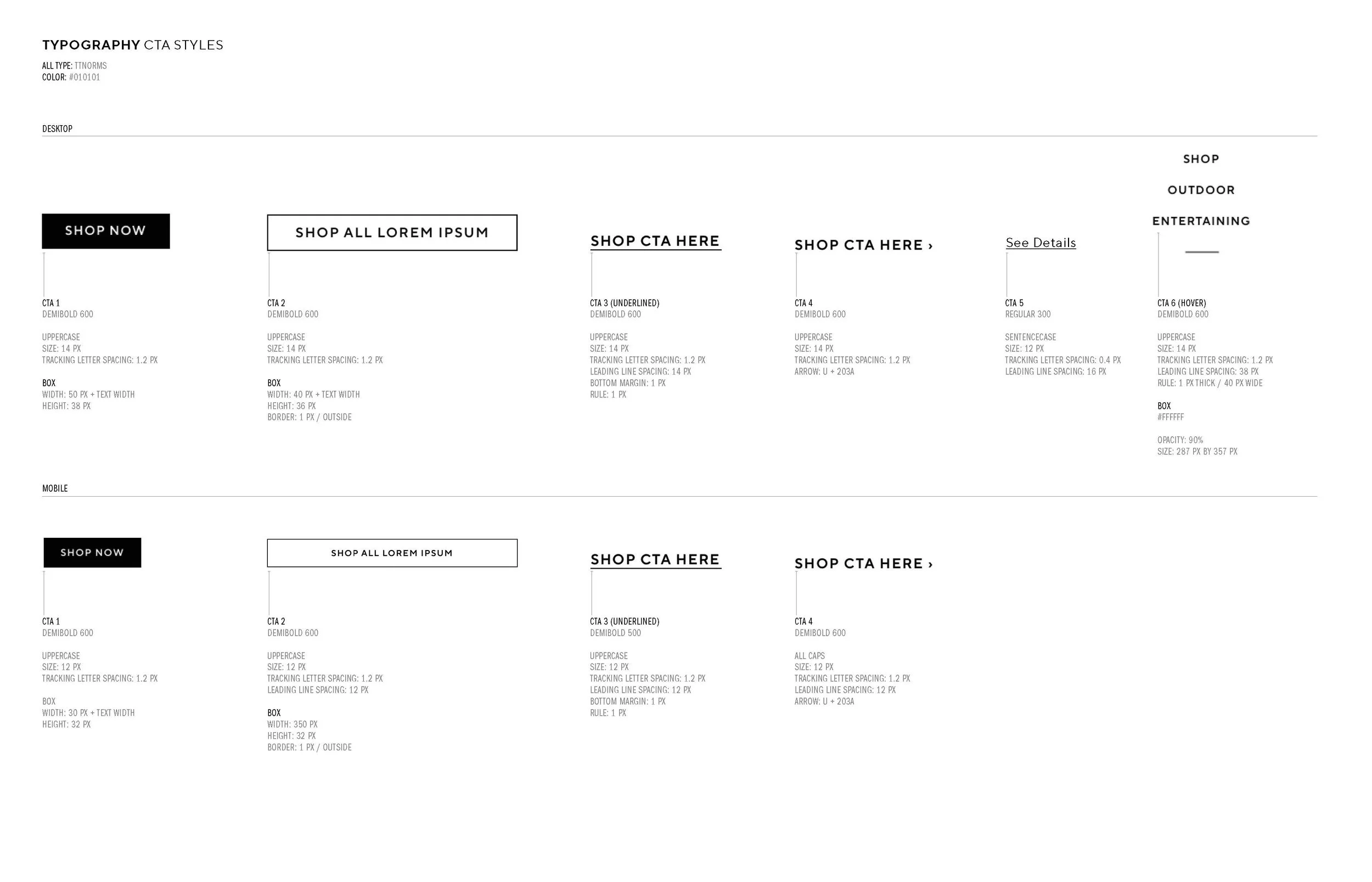
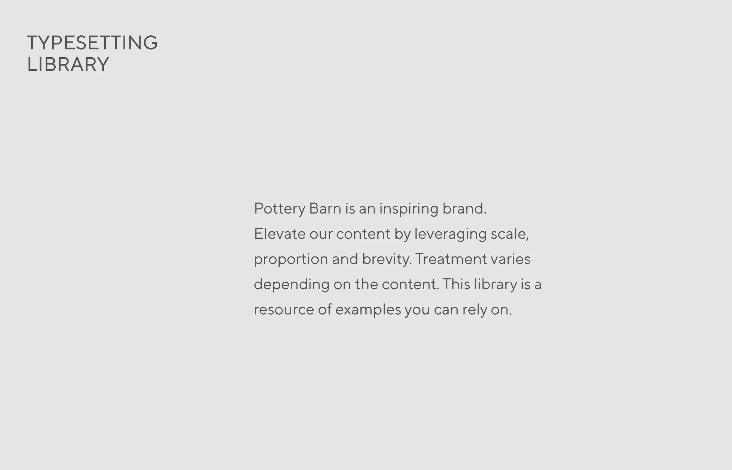
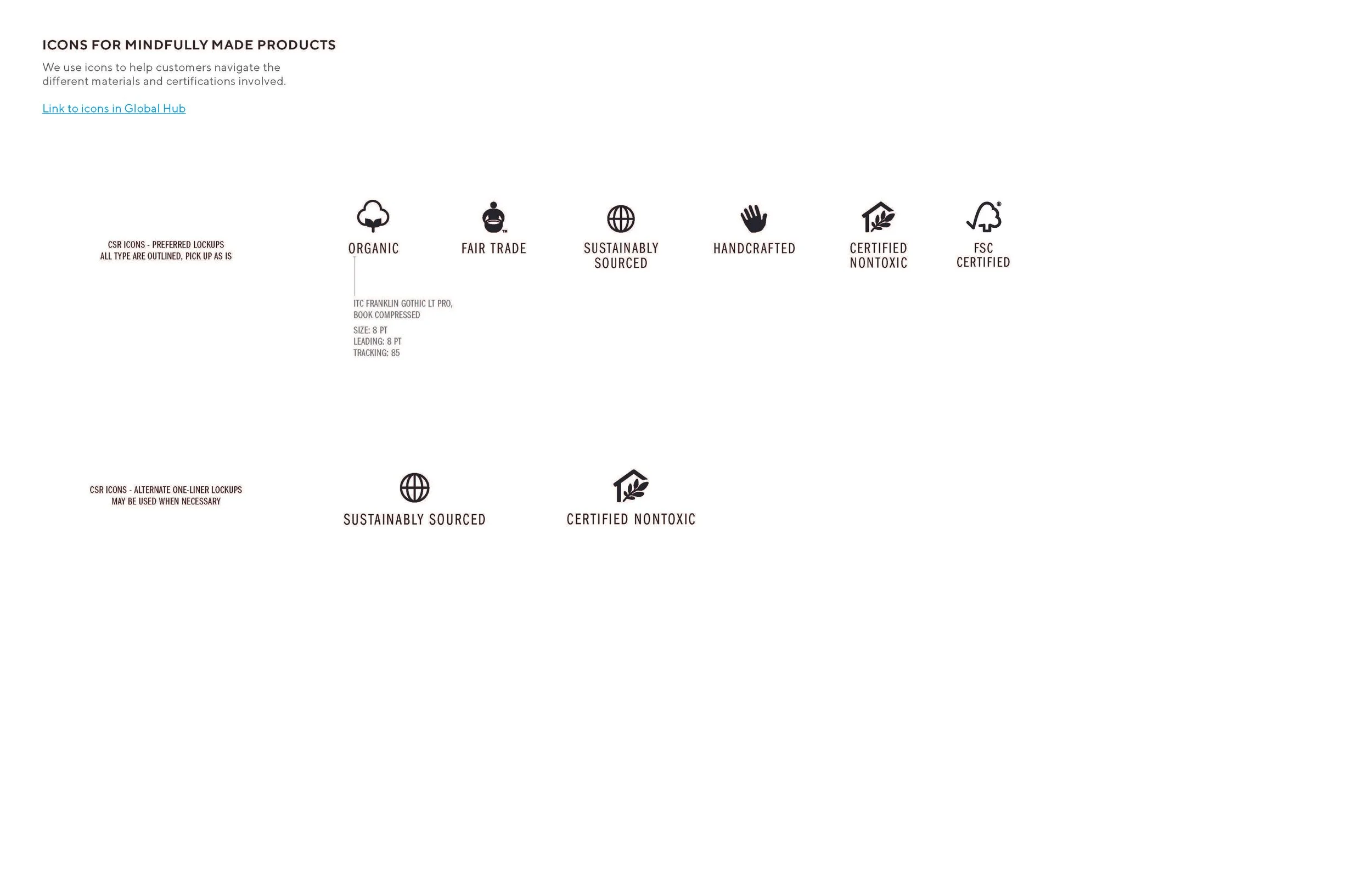
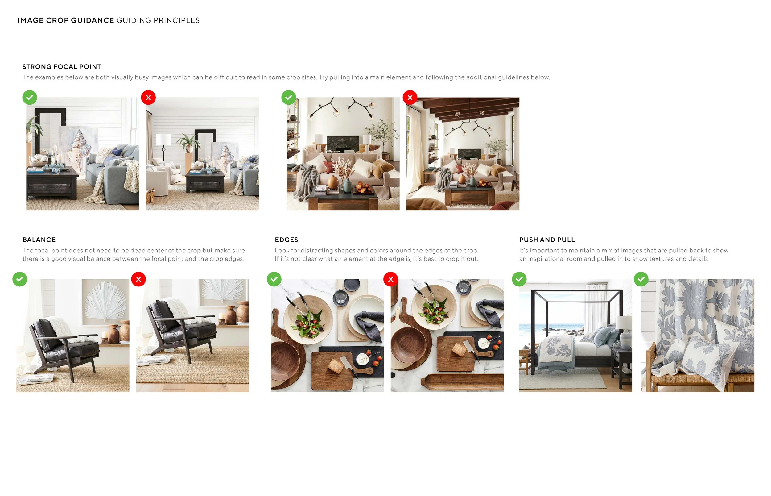
I evaluated existing pages, components, and brand assets to identify gaps and redundancies, then structured the system around key foundations: color, typography, grid/spacing, and reusable UI patterns.
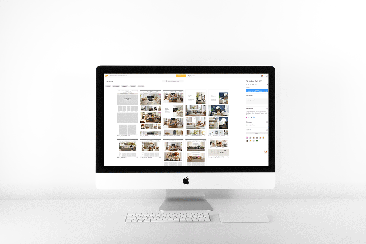
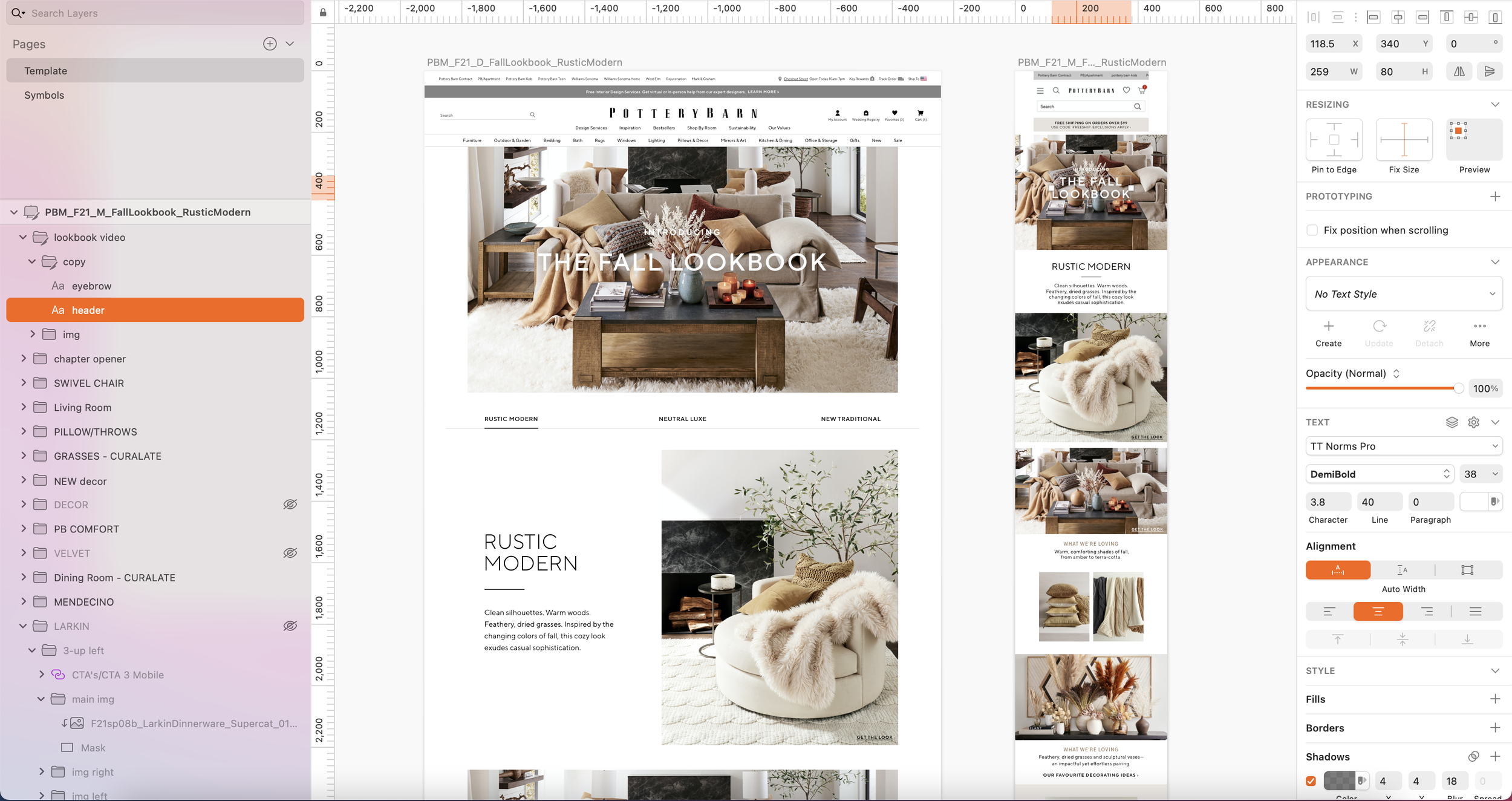
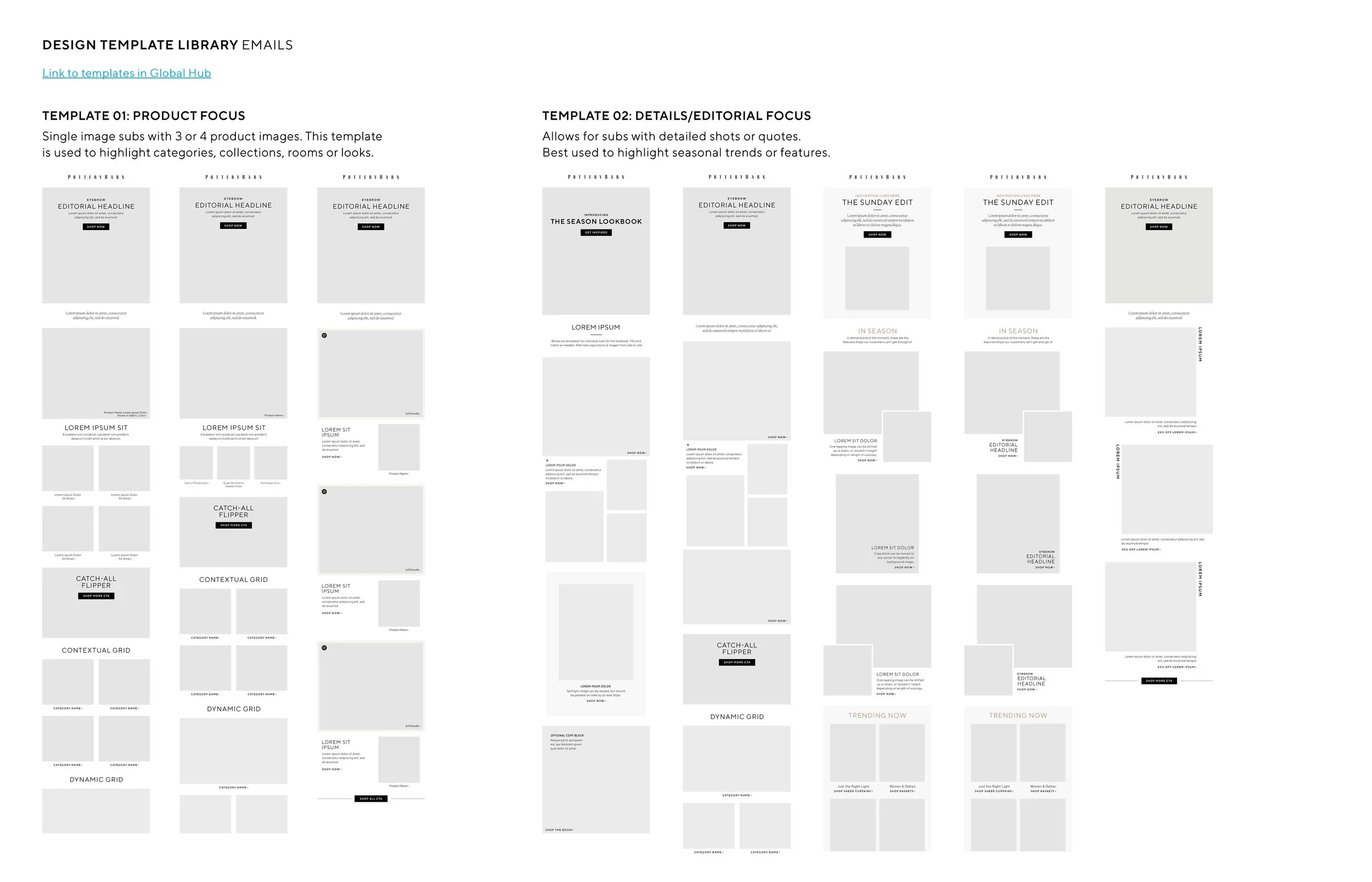
Component & Template Creation
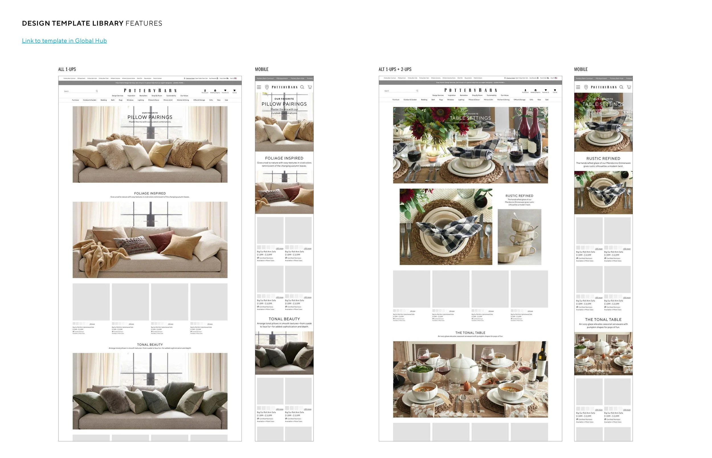
Built a modular library in Sketch + Zeplin, including core UI components, responsive rules, and page-level templates for marketing and merchandising flows.
Documentation & Handoff
Created developer-ready specs, annotations, and usage guidelines to ensure consistency and reduce review cycles. Patterns were tested against real Pottery Barn flows to validate durability across markets and seasons.
Cross-Team Collaboration
Partnered with designers, developers, merchandisers, and brand teams to align requirements, gather feedback, and ensure system adoption.
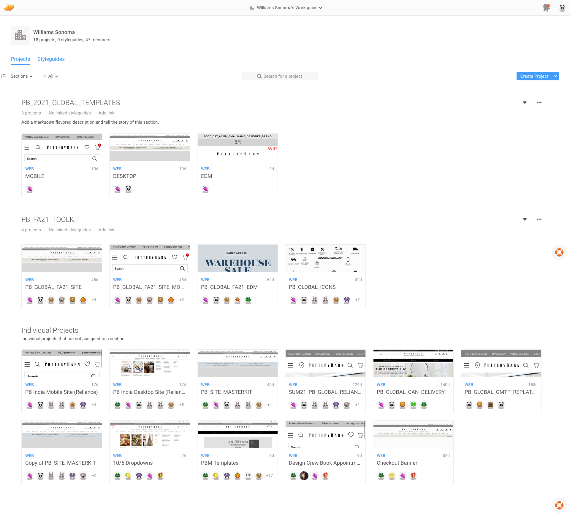
📦 Deliverables
📦 Deliverables
Foundational design system elements
Component library (CTAs, tiles, forms, navigation, promos)
Page templates for global campaigns and merchandising
Documentation: guidelines, redlines, responsive behaviors
⚠️ Challenges
⚠️ Challenges
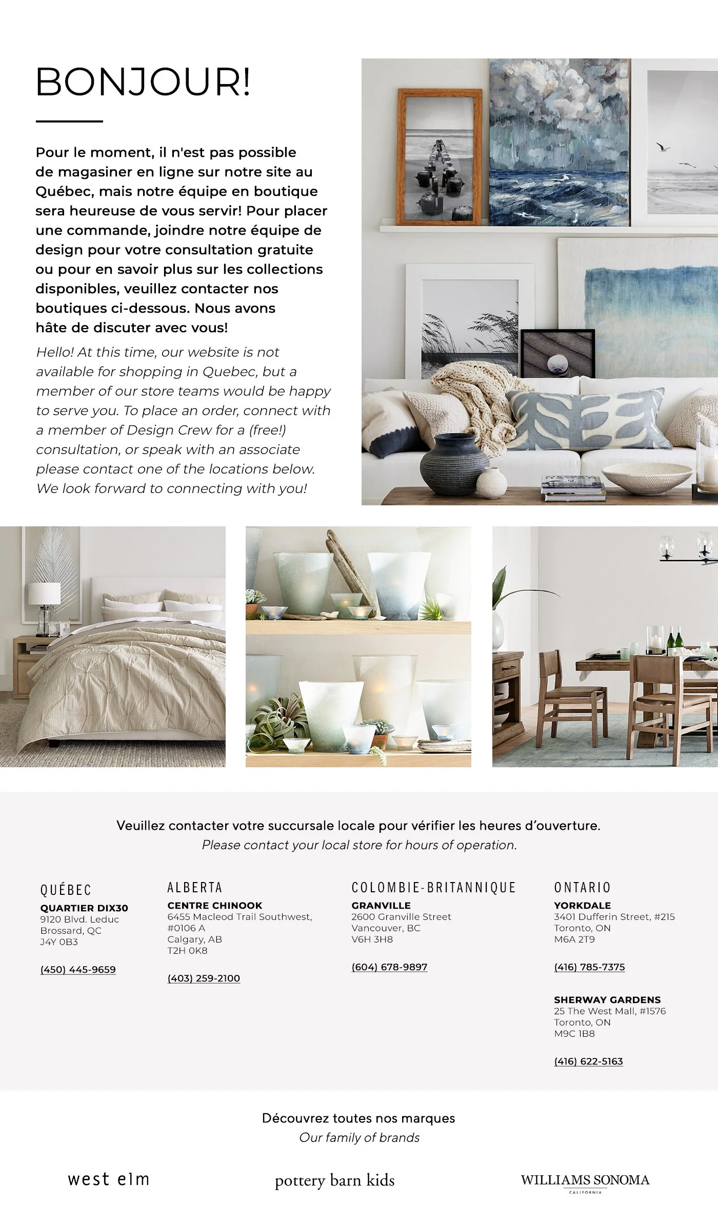
PB regional presence
Americas (US, Canada, Mexico)
UK (online)
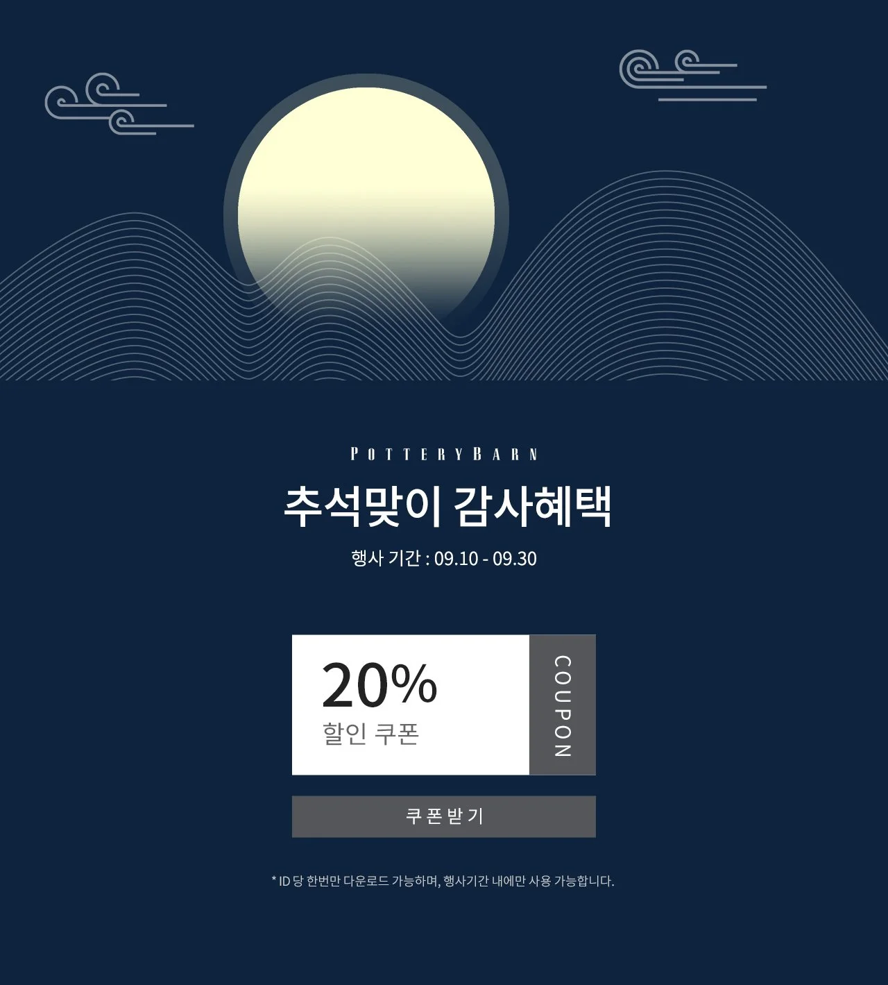
Asia/Pacific (Australia, India, South Korea, Philippines)
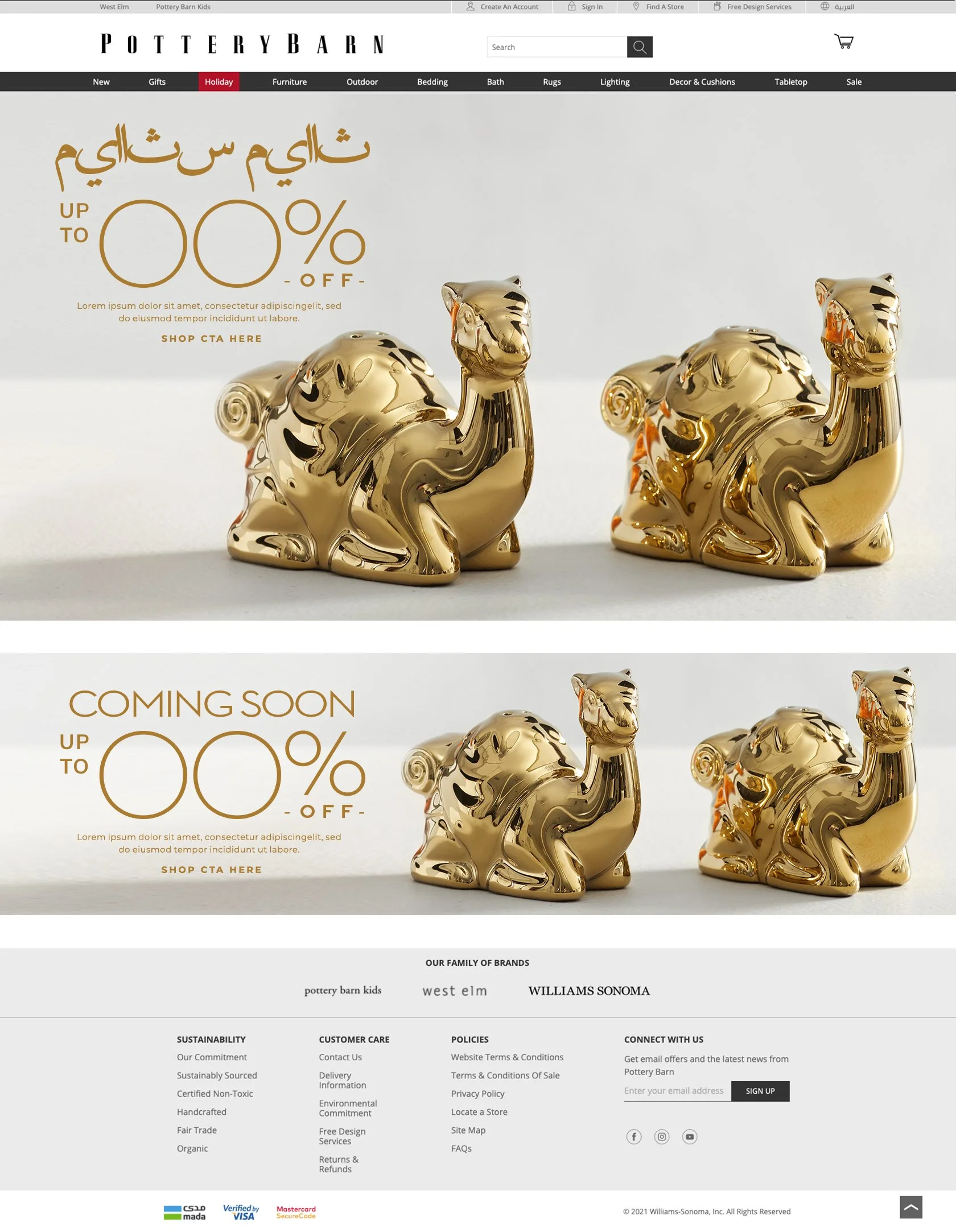
Middle East (KSA, Kuwait, UAE)
Aligning teams with varying design maturity
Supporting rapid (and in some cases expedited) seasonal turnaround depending on global market
Balancing structure with flexibility for global markets
Integrating modern components into legacy code

📊 Impact
📊 Impact
The Global Toolkit became the unified standard for Pottery Barn’s digital design:
40–60% faster page production
Stronger brand consistency across regions
More predictable developer handoff
Faster onboarding for new designers
Long-term scalability for global expansion
The Global Toolkit created a durable, reusable system that elevated visual consistency, reduced production friction, and enabled teams worldwide to build at speed. It remains a foundational asset for Pottery Barn’s digital operations.